
This Nano Banana AI review now focuses exclusively on:
- Adding a well-known public figure beside you on a lakeside bench (photo composite).
- Turning a back-facing cartoon boy into a front-facing version (character turnaround).
Here’s the deal: these two tasks stress different parts of a browser editor—photorealistic person compositing with edge blending, shadows, and perspective, and a semantic re-synthesis of a stylized character (pose/angle change while keeping identity cues). You ran out of trial credits after these two runs, which also tells us something about Nano Banana pricing/usage limits in practice (more on that below). Let’s dive in.
Table of Contents
- What & Who
- Test A: Add a Public Figure Beside the User (Photo Composite)
- Test B: Turn a Back-Facing Cartoon Boy to Front-Facing (Character Turnaround)
- Speed, Quality & Realism Checks
- Pricing & Free Trial (credits reality)
- Best For & Not For (based on your two tests)
- Mini Case: What I’d Replicate in a Week
- FAQ
What & Who
What is Nano Banana (nanobanana.ai)?
A browser-based AI image editor tuned for mask-based edits, context-aware inpainting/outpainting, object insertion/replacement, and quick exports. It aims to accelerate the “remove / add / expand / export” loop without opening a heavyweight desktop suite.
Who benefits most?
- Content marketers who need publish-ready visuals quickly.
- Designers doing first-pass cleanup before pro polishing.
- Social media managers shipping daily thumbnails and carousels.
- E-commerce sellers standardizing backgrounds and fixing distractions.
You’re in the right place if speed matters more than pixel-perfect compositing. On the flip side, complex multi-layer work still belongs in a pro desktop tool.
Test A — Add a Public Figure Beside the User (Photo Composite)
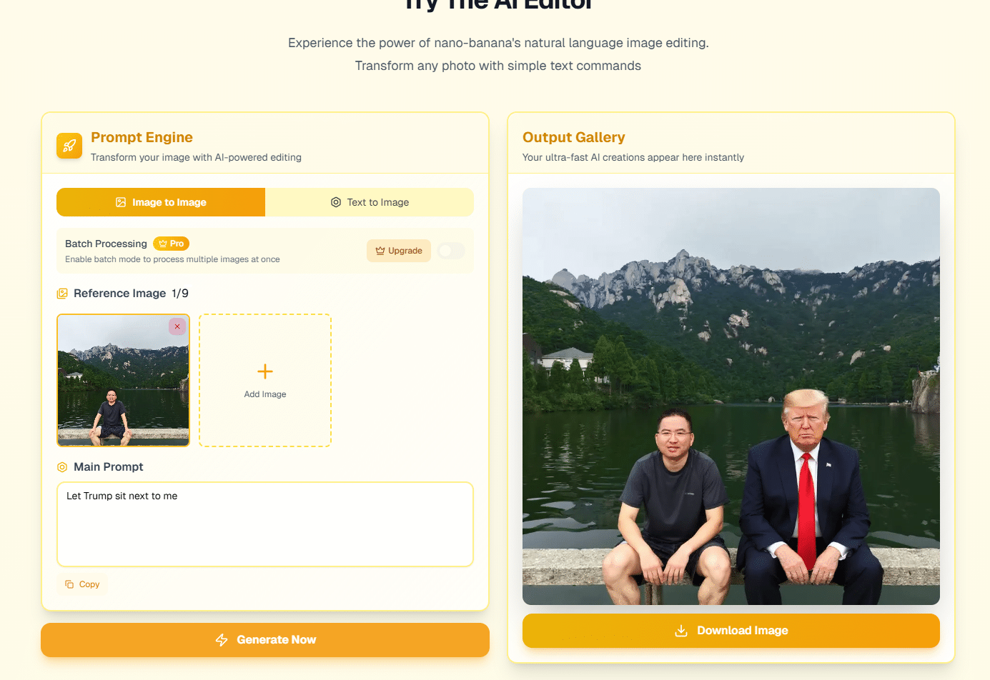
Context
- Source: A lakeside photo of you seated on a wooden bench, mountains and trees in the background.
- Edit goal: Insert a suited individual beside you so it looks like a candid two-person shot.
What worked
- Placement & scale: The inserted subject’s size relative to you is broadly believable; knee and torso proportions align with bench height.
- Edge handling: Jacket and hand contours are relatively clean at normal viewing sizes; no aggressive cutout “stairs” along the sleeves.
- Perspective match: Sitting posture aligns with the bench plane reasonably well—no obvious floating or sinking at first glance.
Where realism slips (real talk)
- Lighting temperature: The ambient scene is overcast with a cool/green cast from foliage and water. The inserted subject reads slightly warmer and more contrasty, which hints at a different capture environment.
- Shadow/ground contact: Subtle shadow under thighs/shoes and environmental reflections on nearby wood/water are minimal. That’s the kicker—our eyes look for contact shadows to accept a composite as “real.”
- Specular mismatch: Skin and fabric highlights don’t fully inherit the soft, diffuse quality of an overcast day.
What I’d try next (quick recipes)
- Prompt constraints: “match overcast lighting, softer contrast, slight green ambient bounce from water.”
- Micro-shadow: Paint a low-opacity shadow under shoes and along the bench rail; even a 2–5% soft burn helps.
- Global tone pass: After placement, apply a tiny cool shift or reduce contrast on the inserted subject for ambient consistency.
Gotchas
Highly reflective water/wood and overcast greens are tough for fast browser edits. Expect 1–2 extra generations or a small finishing pass in a pro app if you need print-level believability.
Test B — Turn a Back-Facing Cartoon Boy to Front-Facing (Character Turnaround)
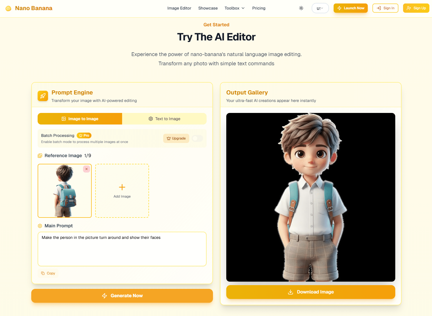
Context
- Source: A stylized 3D/cartoon boy, back turned, teal backpack with brown straps, school uniform vibe.
- Edit goal: Generate a front-facing version that feels like the same character (hair, palette, backpack theme).
What worked
- Identity coherence: Hair color/volume, skin palette, and overall cute 3D style remain consistent between back and front views.
- Accessory continuity: Backpack color and strap concept carry over; the teal + brown scheme survives the turnaround.
- Appeal: The front view reads clean and marketable—good for banners, app UIs, or thumbnails.
Where it drifts
- Micro-details: Pocket stitching, buckle geometry, and fabric patterning aren’t identical—a common trade-off in generative turnarounds.
- Proportions: Minor differences in shorts texture or facial features across iterations can happen (stylized anatomy is forgiving, but keep an eye on it).
- Pose logic: Hands/arm positions look natural, yet if you need exact pose control, you’ll still want rigged 3D or keyframe references.
What I’d try next (quick recipes)
- Reference-anchoring: Prompt with “preserve backpack hardware style and teal/brown palette; same haircut volume.”
- Negative hints: “no extra accessories, no logo changes” to reduce hallucinated details.
- Style lock: Keep the same lighting call (“soft studio key, gentle rim”) across both views for tighter continuity.
Gotchas
Turnarounds are hard for any 2D model. If you need brand-exact details (logos, hardware geometry), consider a small vector/3D polish after generation.
Speed, Quality & Realism Checks (from these two tests)
- Thumbnail readability (200–400px): Both results are readable at small sizes—the composite shows two seated figures clearly; the cartoon boy’s face reads well.
- Edge & hair: Clean enough for web; no glaring cutout noise on sleeves/hair at normal viewing distances.
- Ambient match (composite): The biggest tell remains lighting temperature and missing contact shadows; a quick tone/shadow pass can lift realism.
- Semantic consistency (turnaround): Color palette and accessories remain “same character,” with acceptable micro-variations.
FYI: If your output lives mostly on social feeds and blog headers, these quality bars are typically sufficient. For packaging/print, plan a finishing pass.
Pricing & Free Trial (credits reality)
You exhausted the free test credits after running exactly these two sets, which aligns with typical credit-based browser tools. For current tiers and limits, check the official page: https://nanobanana.ai/pricing
Practical takeaways
- Free tier: Good to validate core edits (one composite + one character task), but it runs out quickly.
- Entry/Creator plan: If your weekly workload looks like these two tasks repeated at scale, this tier likely covers you.
- Team needs: If multiple people will run variations or batch composites, consider a plan with more credits/seats.
Best For & Not For (based on your tests only)
Best for
- Social/content teams who must ship believable two-person composites fast (web-level realism).
- Product/brand visuals where a stylized character needs front/back variants for UI or promos.
- Solo creators who don’t want to juggle plugins or desktop suites for simple wins.
Not for
- Pixel-perfect photoreal where shadow/reflection physics must be exact (ads with strict QC).
- Brand-exact turnaround where micro-hardware/logo details must match 1:1.
- Heavy, layered composites or retouching that demands pro masking and blend modes.
Two mini workflows (directly inspired by your tests)
- Lakeside composite polish
- Insert second subject → tone-match for overcast → paint a 2–5% soft contact shadow → export wide and square.
- Use on blog hero and social; sanity-check on mobile.
- Character pack for product page
- Generate front/back poses with style lock → normalize palette → export transparent PNG + web JPG.
- Drop into a tool list or “About Our Mascot” section.
Mini Case — One-Week Replication Plan (no extra credits required once upgraded)
- Day 1: Recreate your two successes at two additional locations/characters to confirm consistency.
- Day 2: Composite polish pass—tone matching + micro-shadows; build a quick preset checklist.
- Day 3–4: Character set expansion—front/side/back poses with the same studio lighting.
- Day 5: Export and publish variants; A/B thumbnails that use the composite vs. the original single-subject photo.
FAQ
Q: Can I get deeper control over lighting to fix the composite mismatch?
A: You can nudge it with prompts and slight global corrections. For exact matches (shadow direction/reflections), plan a brief pro-app finishing pass.
Q: Is the free tier enough for weekly use?
A: Based on your experience, it’s enough to validate—but it runs out after 1–2 substantial edits. For recurring workflows, budget for a paid tier.
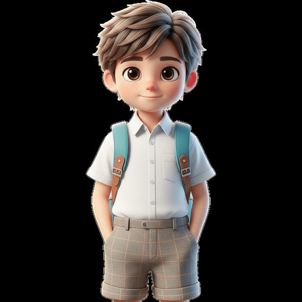
Q: Does it export transparent PNGs for the cartoon?
A: Yes in common browser editors; confirm in the export dialog. Transparent outputs make the character easy to reuse.
Q: Will it keep accessories identical across turnarounds?
A: Close, not perfect. Add “preserve hardware style/palette” to prompts, but expect small differences that may need touch-ups.
Wrap-up & CTA
Bottom line
- From your two tests alone, Nano Banana proves useful for fast, web-ready compositing and convincing cartoon turnarounds.
- The main realism gap in the composite is ambient match and contact shadows—fixable with a tiny tone/shadow pass.
- The character turnaround keeps style and palette; micro-details may vary (normal for 2D generative pose changes).
The takeaway (actionable)
- Add prompt constraints for ambient light and straight lines.
- Always do a 2–5% contact shadow under added subjects.
- For characters, lock palette and use negative prompts to avoid extra accessories.
- Plan a light finishing pass if assets go beyond web/social.
If you want more hands-on playbooks like this, Join our free weekly newsletter for hands-on AI workflow tips.
P.S. Free to use NanobananaAI : https://aistudio.google.com
Comments